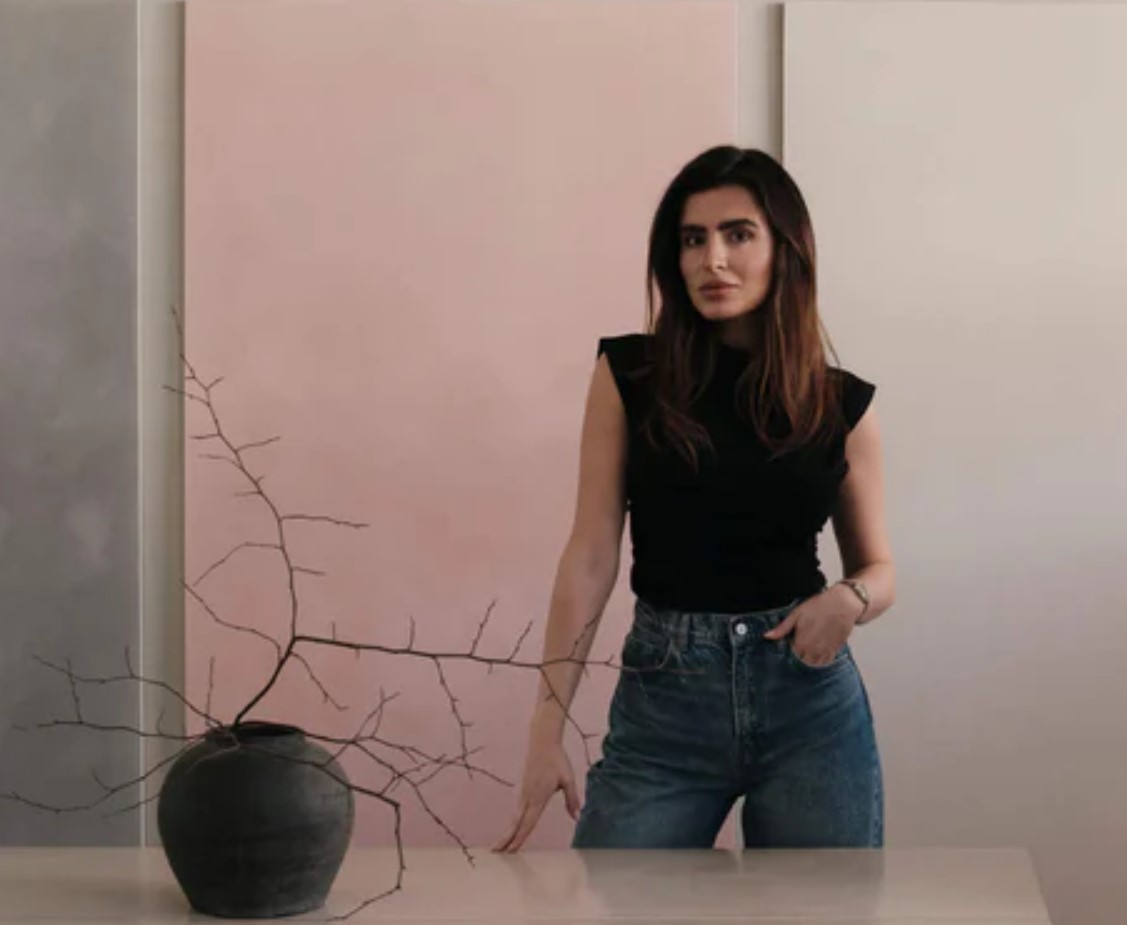
Written By: Alicia Kunkel
This year Pantone named Mocha Mousse as 2025’s Color of the Year. We reached out to the premiere color house Color Atelier, known for their all-natural pigments, and spoke to one of its founders Burcu Garnier, for her take on the Pantone’s choice and other color trends she is seeing designers reach for this year.
What brought you to the luxury paint industry?
I have always been passionate about the intersection of art, design and sustainability. We saw a gap in the market for high-quality, artisanal finishes that are both environmentally friendly and aesthetically refined. My journey with Color Atelier started as a commitment to bringing time-honored European craftsmanship into modern spaces, offering a sophisticated yet natural approach to interior design.
Why did you choose to create natural mineral-based paints?
Natural mineral-based limewash paints have an inherent beauty that synthetic paints simply can’t replicate. They provide a depth of color, a soft matte finish and a unique movement that makes walls feel alive. Beyond aesthetics, they are healthier for both people and the environment—free from harmful chemicals, breathable and mold-resistant.
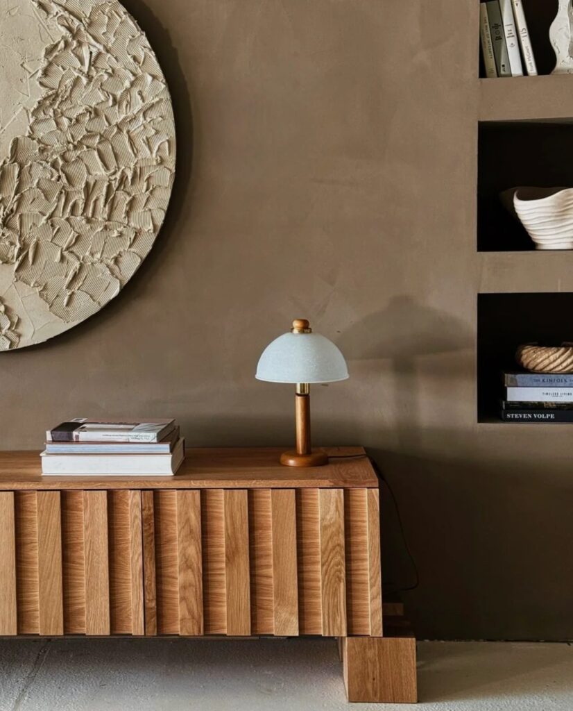
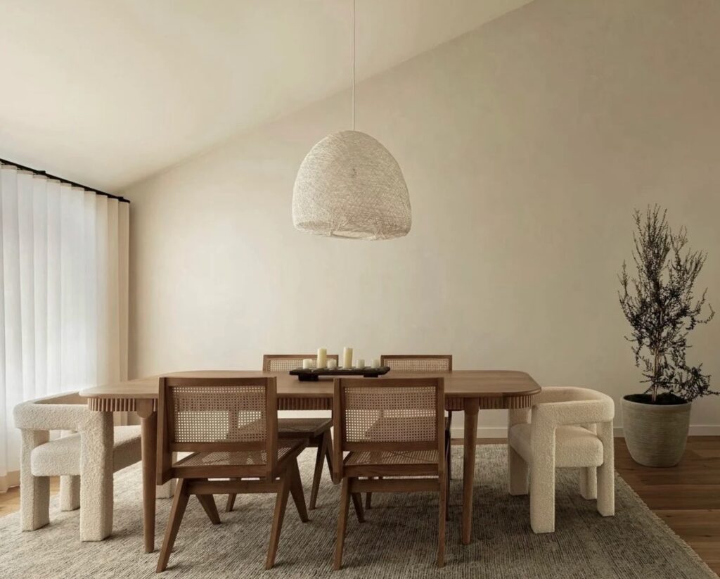
This year, Pantone chose Mocha Mousse, a rich neutral brown, as the color of the year. If a client wanted to paint their space in this color tone, which of your colors would you recommend?
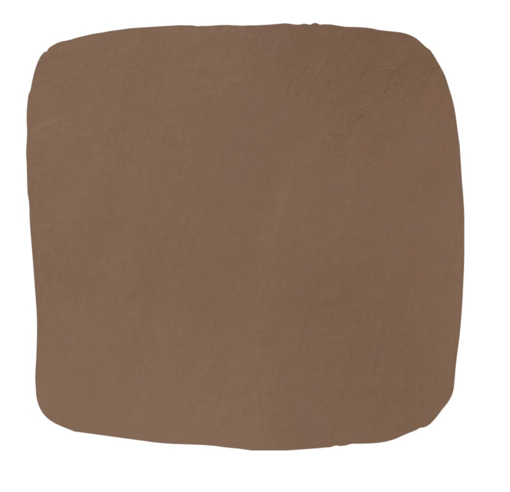
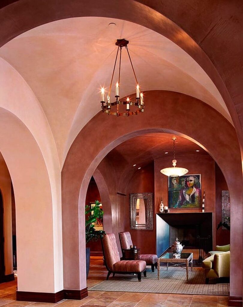
For a similar warmth and depth, I would recommend our “Chocolat” or “Espresso” shades. Chocolat offers a rich, velvety brown with warm undertones, while Espresso is a deeper brown packed with warm tones that give a unique depth of color and an earthy darkness. Both capture the richness of Mocha Mousse while offering a natural, velvety finish. These shades are versatile and work beautifully across different lighting conditions.
Do you feel that a neutral brown hue evokes a certain ambiance or aura in a room?
Absolutely. Neutral browns create a grounding and inviting atmosphere. They have an innate connection to nature, making spaces feel warm, cozy and cocoon-like. Whether used in a contemporary or classic setting, brown hues bring a sense of stability and understated luxury, making them a perfect choice for intimate and sophisticated interiors.
Which colors would you choose to complement a Mocha Mousse-toned palette?
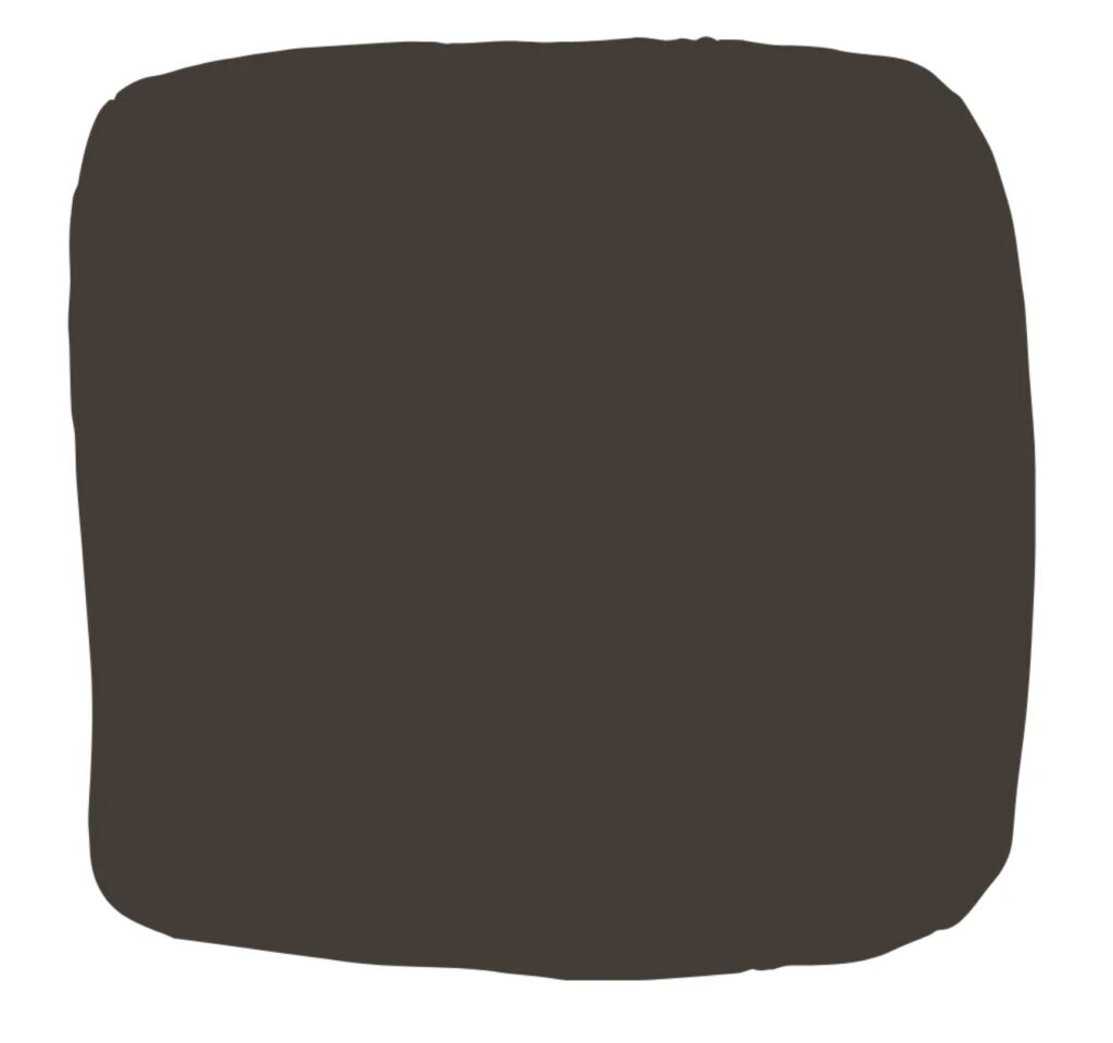
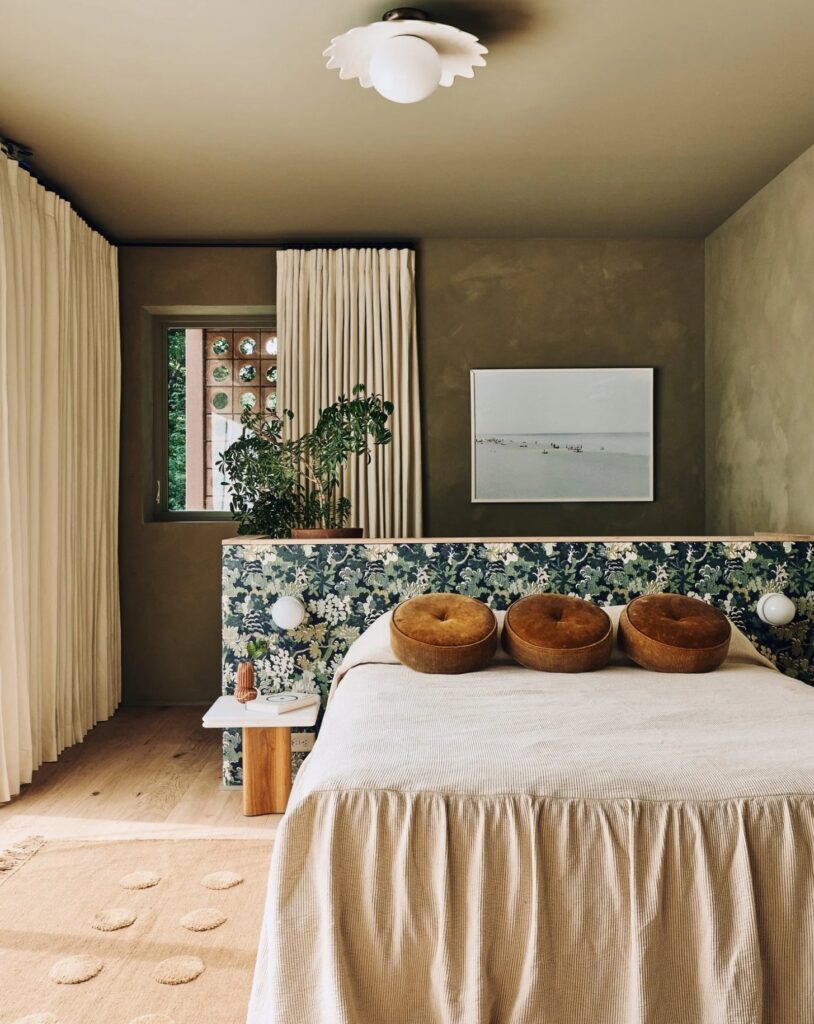
To complement Mocha Mousse, I would suggest earthy, muted shades like soft ochres, warm beiges, and deep olive greens for a harmonious, organic look. For a bolder contrast, deep charcoal or a moody blue can add depth and modernity while still keeping the palette sophisticated and balanced. I recommend our shades, Plateau: A versatile off-white with light grey-beige tones, offering subtle nuances that balance warmth and coolness; Tagine: A warm, earthy hue that complements brown tones, adding depth and richness to the palette; and Noir: a strong yet soft black with slightly warmer undertones, providing a striking contrast to Mocha Mousse-inspired shades.


More and more designers are choosing to create using lime and mineral-based paints. Why do you think this trend is happening?
Designers are increasingly drawn to authenticity and craftsmanship. Lime and mineral-based paints offer a textural depth and natural elegance that modern synthetic paints lack. They age beautifully, develop a patina over time, and contribute to healthier indoor air quality. As sustainability and wellness become central to design, these traditional finishes are experiencing a well-deserved resurgence.
What other colors are you seeing trend for this year?
Alongside warm, grounding neutrals, muted blues, soft terracottas, and earthy greens are emerging as dominant trends. These shades reflect a growing desire for connection to nature and a sense of tranquility in interiors. We’re also seeing more interest in chalky off-whites and dusty pinks, which add softness and warmth without overwhelming a space.
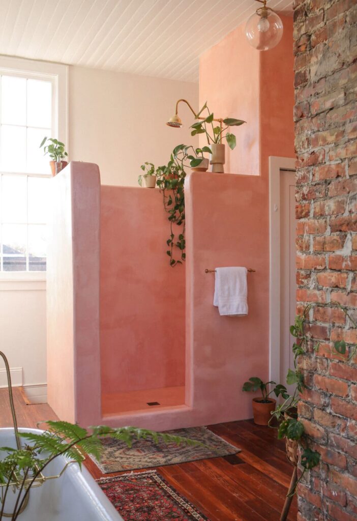
If a client wanted to achieve a lime paint look in a space that has a lot of moisture, such as a bathroom or a garden space, what kind of paint would you recommend?
For high-moisture areas, I recommend the Color Atelier Tadelakt, designed for use in wet areas like showers, tub surrounds, and backsplashes. It can also be used for decorative dry area applications, and outdoors. Tadelakt, an ancient lime plaster finish, dates back to Romans, originated in Morocco. For millennia, it has been appreciated for its beauty, and function. Color Atelier Tadelakt is manufactured in America with the highest quality natural ingredients, and for the type of substrates we typically encounter in modern construction. It produces seamless, elegant, and durable applications.
Does your company create custom colors?
Yes! At Color Atelier, we offer bespoke color-matching services to bring our clients’ visions to life. Whether inspired by a historic shade, a natural element, or a fabric swatch, we work closely with designers and homeowners to craft unique, one-of-a-kind colors that perfectly suit their spaces.
TO EXPLORE MORE VISIT: COLOR ATELIER
- Photo Credits: Color Atelier